Twitter’s web interface is simple and intuitive but lacks a few features that can make it much better. In this article, you’ll read about 10 excellent user interface features that can enhance the Twitter web experience.
1. Enable grouping of friends and followers

Figure 1 shows tabs that you can use to quickly see tweets in a particular group.
Twitter’s increasing popularity has gotten many people on board and using the web application. With the growing number of active users comes the need for following more people.
The ability to create groups (or categories) of Twitter users that you follow can reduce the noise in your Twitter feed and can help you immediately see updates from particular groups of users.
For example, having a group for "co-workers" or "local tweeters" can help you quickly see what your co-workers are saying or find up-to-the-minute information on local events such as traffic accidents.
2. Auto Complete in Tweets

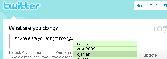
Figure 2 shows an auto complete dialog box appears when you type the @ symbol.
Auto complete is an interaction design pattern that involves displaying a list of suggestions as the user types in text. Auto complete can speed up the process of sending a tweet directed to a particular user using the @username format.
It will also help in times where you’re having trouble spelling someone’s username.
Another application of the auto complete feature is for suggesting #hashtags (keywords associated with a tweet) to make keyword-tagging of tweets easier.
3. Text links in tweets

4. Tweets-threading
Twitter is a great source of information and is a wonderful forum for discussing various topics. Unfortunately, the current user interface doesn’t allow you to easily view a conversation between two or more people.

Figure 3 show how threaded comments could look.
Threaded tweets can also serve as a means for people to find other Twitter users that are interested in similar subjects of conversation.
5. Allow Tweets directed to a group of people ("group tweet")

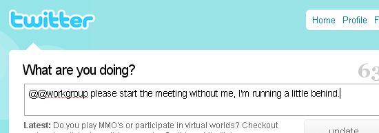
Figure 4 shows a possible syntax for tweets directed to a group of users using a double @ synax.
With companies and communities joining in on the fun, the ability to tweet to a group of Twitter users offers a convenient way of specifically targeting a set of people. For example, if you wanted to tweet to your co-workers, the syntax could be:
The double
@ serves to differentiate a tweet directed to a single user from one that’s directed to a group of users.6. Display meta data through hover tooltips

A tooltip is an effective graphical user interface element that allows users to view more information when they hover or click on a text or object of interest without having to leave the current web page. They enable information-gathering with fewer clicks and fewer pages to visit.
One way tooltips can be helpful is in seeing the bio information of a Twitter user when you hover over their username on your Twitter feed. If you see a username mentioned in an interesting Twitter update, simply hover over the name to see more information about the user that was mentioned.
7. Use the sidebar more effectively to display information

Figure 5 shows a "Recent @Replies" and "Popular #hashtags" section on the side bar.
Twitter can utilize the right sidebar more effectively by showing relevant information and statistics. For example, a "Most Recent Replies" section or a "Most Used #hashtags" section can be very helpful in showcasing the latest activities and the hottest topics.
8. Add a page that displays tweets mentioning your username
Twitter users (me included) like seeing their names mentioned. Currently, only @replies (tweets that begin with @username) can be seen in the @Replies page. A nice optional feature would be to have a page that lists tweets where your username is mentioned or where a particular tweet of yours is re-tweeted (example: "RT @username").
A less self-centered benefit for this feature is the opportunity to find people who are interested in what you have to say, enough that they update their own Twitter feed with a tweet of yours, or to see what types of your tweets are popular amongst people who follow you.
9. Highlight specific users, deemphasize others in feed

Figure 6 shows the first tweet as being highlighted, and the second tweet being deemphasized. The third tweet is how tweets normally look like in the current interface.
Users who follow many people run into the trouble of Twitter feed overload where there’s just too much going on and too many tweets to read. The ability to mark favorite Twitter users, as well as deemphasize users that you don’t care much about (but still want to follow for some reason), can give users better visual queues on what to pay attention to first when perusing one’s Twitter feed.
10. Add a Built-in URL shortener
With Twitter’s current user interface, hyperlinks are counted towards your 140 character count limit even if it gets reduced in length by a URL-shortening service like TinyURL.com after you hit the "Update" button.
One way to allow users to enter more text - without having to go to another website just to shorten URL’s - is to have a built-in URL-shortening feature. This would not only save user’s some time, but also eliminates the need to rely on other websites to perform an action that should really be handled within the system.
Read the story here.


 Facebook:
  LinkedIn:
  Twitter:
Post a Comment